FinAlyzer
A financial consolidation, reporting, and analytics platform. Founded to save time, reduce human error, and improve efficiency through automation
Business Challenge
FinAlyzer is a financial platform that enables companies to perform financial consolidation, reporting, and analytics. Originally created to eliminate inefficiencies caused by manual data handling and to reduce human error through automation, the tool gradually evolved.
Driven by customer requests, competition, and internal innovation, FinAlyzer became highly feature-rich—but also feature-heavy, making it difficult to navigate and use.
Founders, implementation partners, and users began facing serious challenges due to an overwhelming interface, scattered functionality, and inconsistent UI. A redesign was necessary to enhance usability and aesthetics, and align the tool with evolving business needs.
Target Audience
AccuConsolidate is used by a variety of users across financial and strategic roles in medium to large organizations, including:
- Financial Analysts
- Controllers & CFOs
- Implementation Partners & Consultants
- Internal Reporting Teams
- System Administrators
These users rely heavily on timely, error-free reports and dashboards, often under strict regulatory and organizational timelines.
Pain Points Addressed
Feature Overload
Users were overwhelmed by the number of options, often missing out on new or important features.
Complex Navigation & Technical Jargon
Complicated menus, unclear labels, and technical terms confused users and hindered task completion.
Cognitive Overload
Setup areas were cluttered with irrelevant options, making it difficult for users to configure the tool effectively.
Task Disorientation
Related actions were spread across different parts of the interface, making multi-step workflows inefficient and error-prone.
Error Prone Data Uploads
Users often uploaded data to the wrong period or ledger, leading to downstream confusion.
Non-Intuitive Dashboard & UI
Dashboards lacked visual appeal and interactivity. UI elements were inconsistent, further degrading usability.
Low Feature Discoverability
Useful features went unnoticed due to poor hierarchy and lack of updates within the UI.
Design Intervention
To address these issues, we initiated a multi-phase redesign project focused on the "Output" section (Reports & Dashboards), the most frequently used part of the platform.
1. Research & Discovery
- Interviews with stakeholders, users, and implementation partners
- Walkthroughs of the existing product
- Categorized platform into three functional areas:
(i) Input: Data ingestion
(ii) Setup: Configuration and settings
(iii) Output: Reports and dashboards
2. Design Strategy & Execution
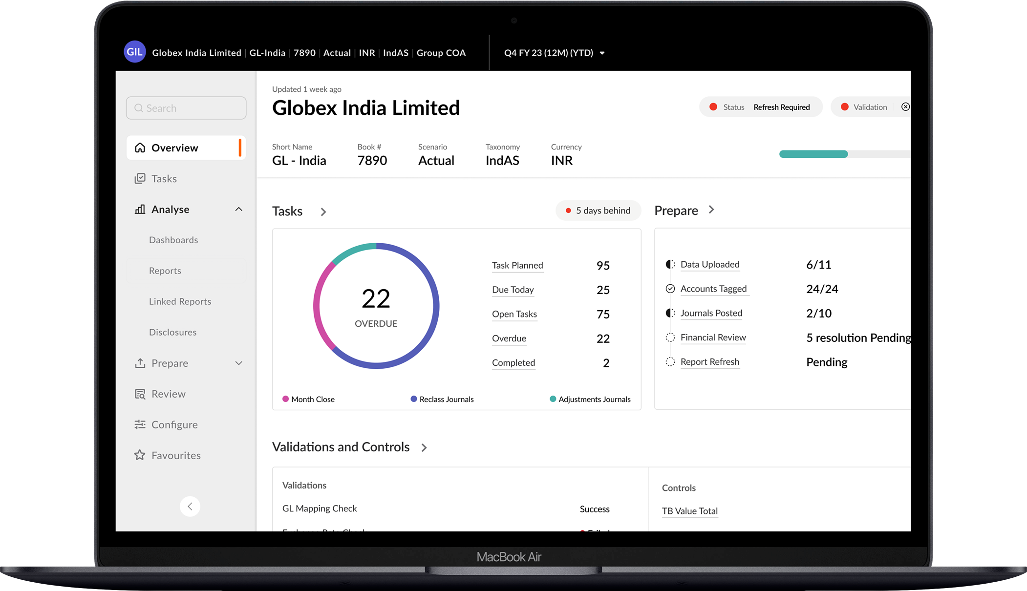
Feature Visibility & Updates
Introduced a dedicated section highlighting new features and license-specific information.
Simplified Terminology & Contextual Help
Replaced technical jargon with intuitive language and added explanatory labels for clarity.
Step-by-Step Workflows
Designed linear task flows to guide users from start to finish for both simple and advanced actions.
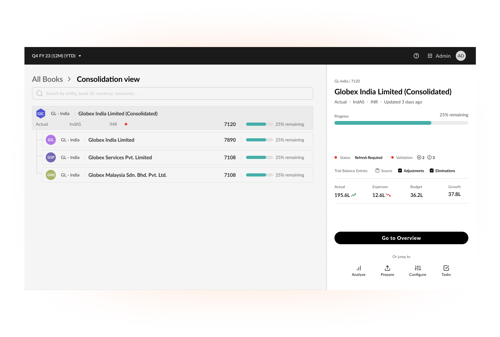
Ledger-Centric Design
- Made ledger selection the first step post-login
- Displayed preparedness status per ledger (e.g., warnings, pending tasks)
- Introduced ledger color coding and always-visible ledger headers for contextual clarity
Navigation Overhaul
- Split into Global Navigation (persistent) and Ledger-Specific Navigation
- Grouped all analysis-related outputs under one renamed section: “Analyse”
Improved Real Estate Management
Minimized toolbar and metadata clutter, allowing more space for actual data display.
Dashboard Creation Simplified
Redesigned dashboard and report creation flows, aligning them with modern standards and improving widget management.